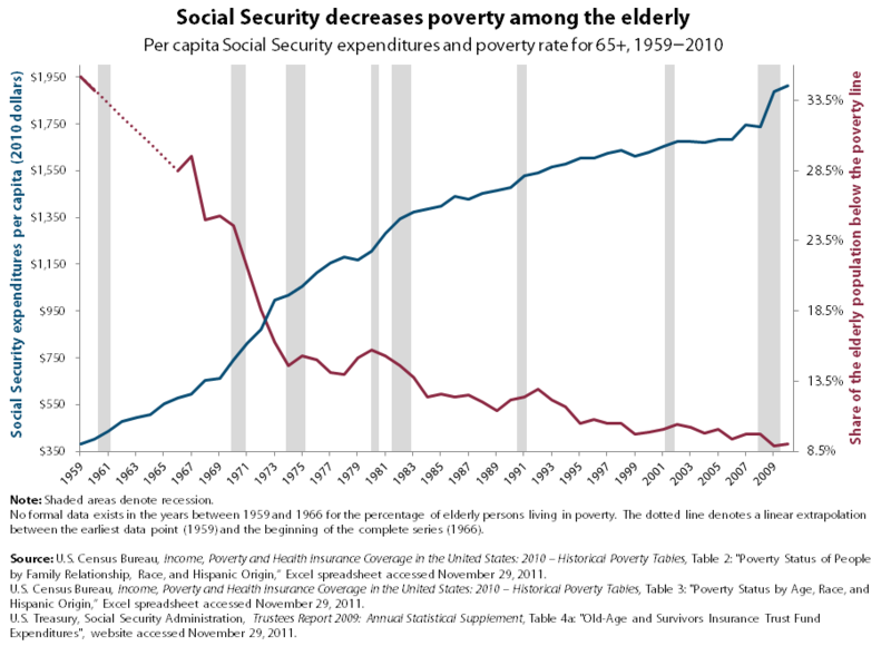
The blue line indicates per capita Social Security expenditure (in 2010 dollars), while the red line indicates the percentage of the population aged 65 or older with an income at or below the poverty line.

Indicators of vulnerability among people with Medicare and private insurance
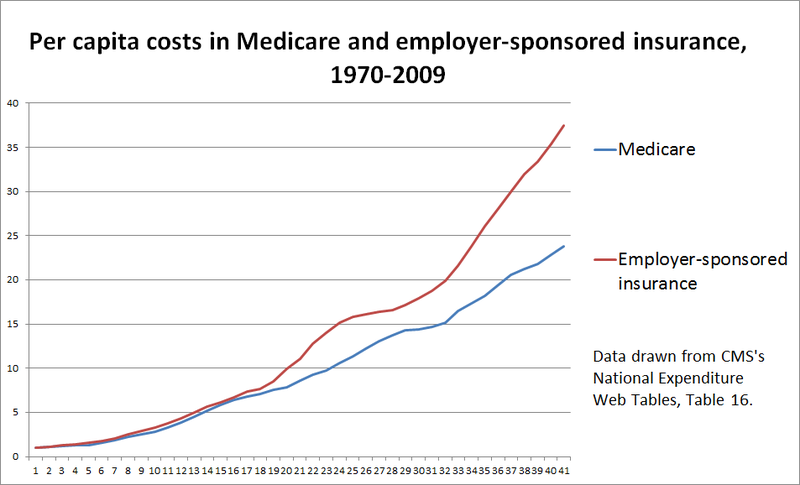
For comparison, per-capita costs in 1970 are set to 1. The red line represents private insurance cost growth and the blue line represents cost growth in Medicare.
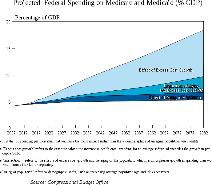
Projected federal spending on Medicare and Medicaid as a percentage of GDP
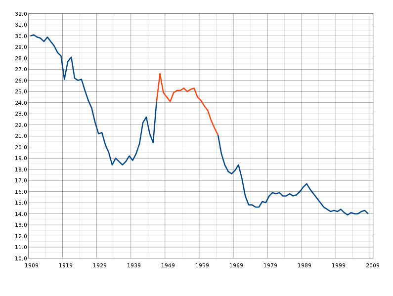
Births per thousand people in the United States from 1909-2008. The red segment is known as the Baby Boomer period.
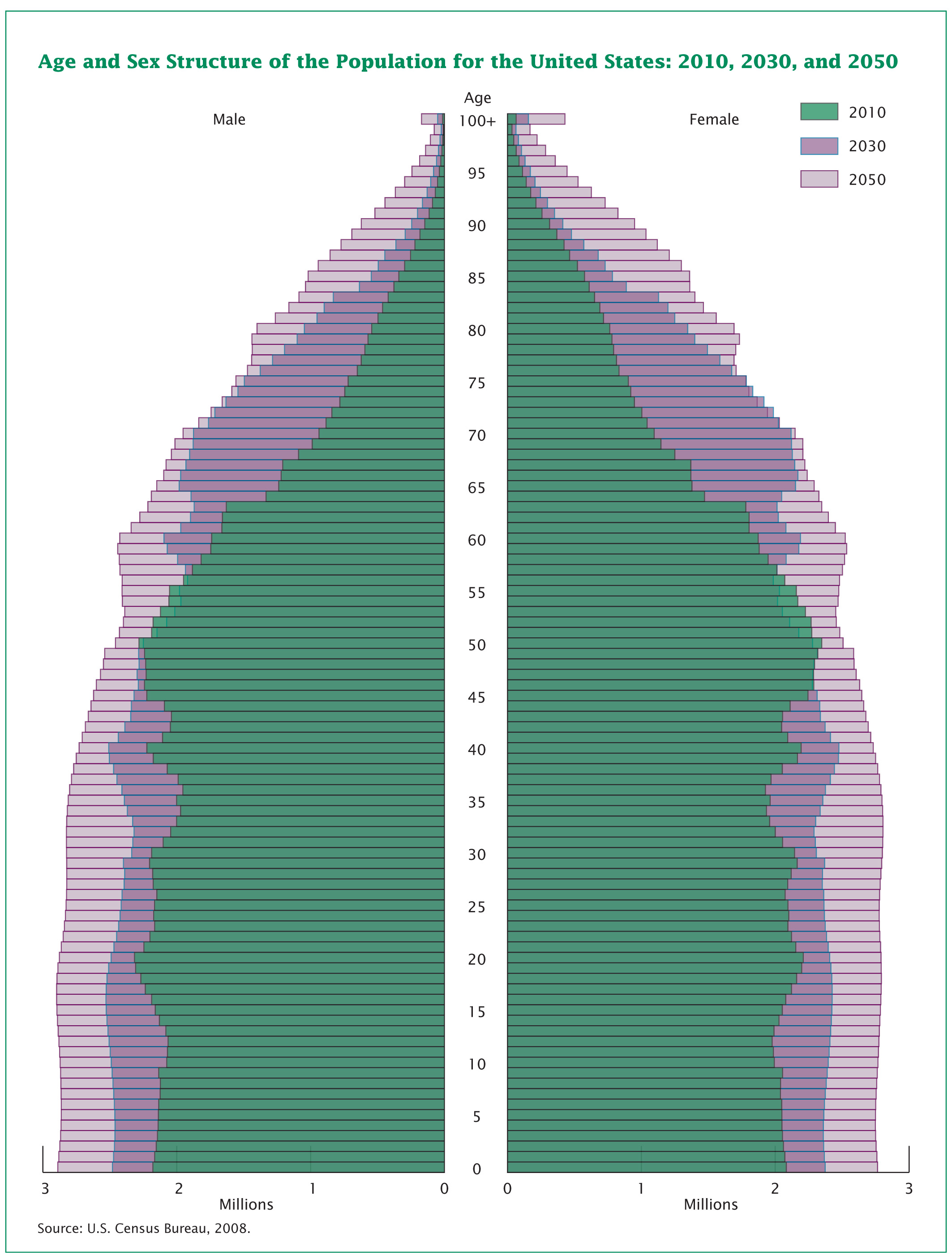
The age structure of the overall population is projected to change greatly over the next four decades. Much of this change is driven by the aging baby boomers and trends in immigration.
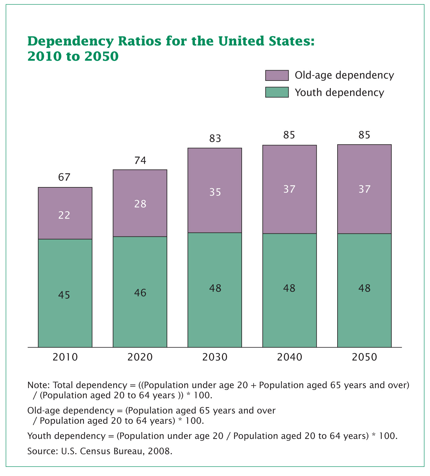
One way to examine the changing age structure of the population is to look at dependency ratios, which indicate the potential burden on those in the working-age population. The total dependency ratio is projected to increase from 67 to 85 between 2010 and 2050, as more baby boomers move into the 65 and older category.
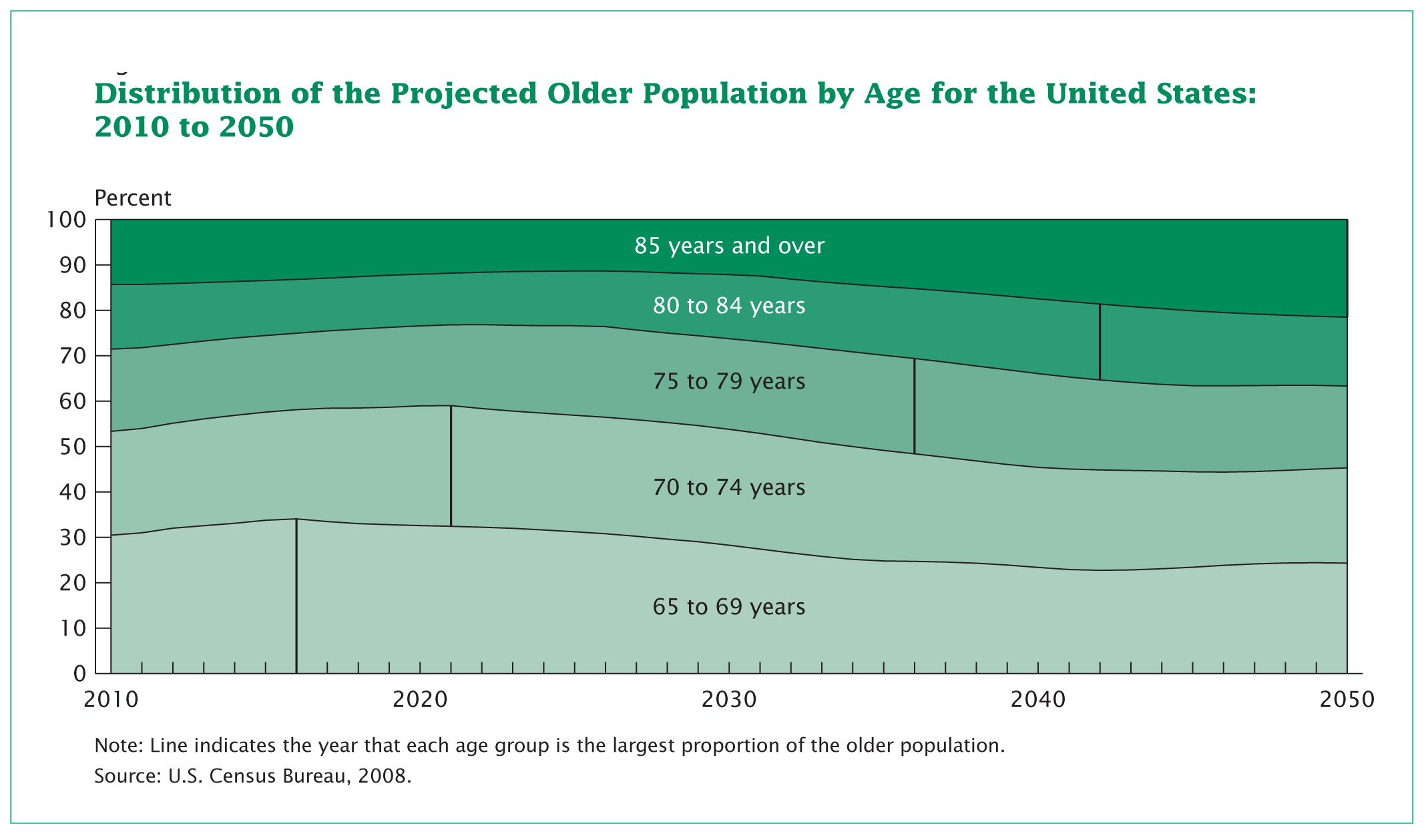
The age composition within the older ages is projected to change between 2010 and 2050. As the baby boomers move into the older age groups, beginning in 2011, the proportion aged 65–74 is projected to increase.