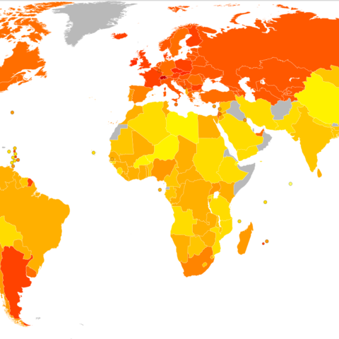
![World Map of energy consumption (kcal/person/day) in 1961, from under 1500 (light yellow) to over 3500 (dark red) and a global average of 2,253.9 World Map of energy consumption (kcal/person/day) in 1961, from under 1500 (light yellow) to over 3500 (dark red) and a global average of 2,253.9](/sites/default/files/styles/large/public/3-6-map786_0.png?itok=JCB-1P6j)
Source: Creative Commons License (Lokal Profil)
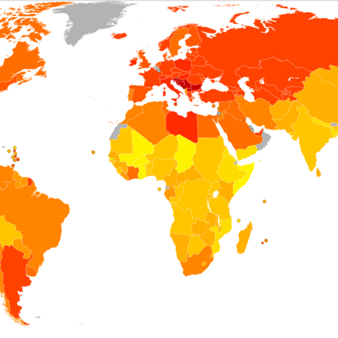
![World Map of energy consumption (kcal/person/day) in 1981, from under 1500 (light yellow) to over 3500 (dark red) and a global average of 2,550 World Map of energy consumption (kcal/person/day) in 1981, from under 1500 (light yellow) to over 3500 (dark red) and a global average of 2,550](/sites/default/files/styles/large/public/3-6-map787_0.png?itok=r9Y3f6F9)
Source: Creative Commons License (Lokal Profil)
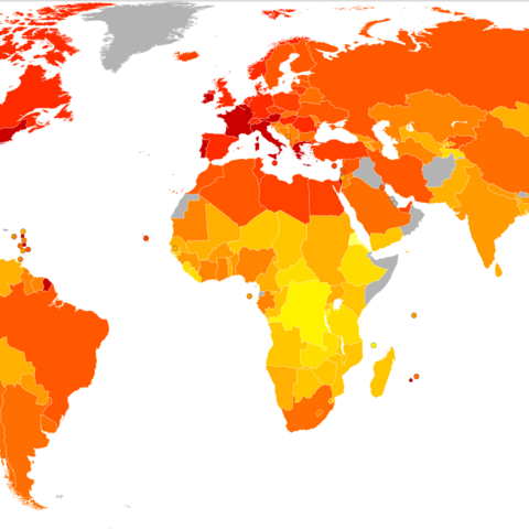
![World Map of energy consumption (kcal/person/day) in 2001, from under 1600 (light yellow) to over 3600 (dark red) and a global average of 2,800 World Map of energy consumption (kcal/person/day) in 2001, from under 1600 (light yellow) to over 3600 (dark red) and a global average of 2,800](/sites/default/files/styles/large/public/3-6-map788_0.png?itok=MfBjbqDf)
Source: GNU License (Lokal Profil), from FAO World Report Data
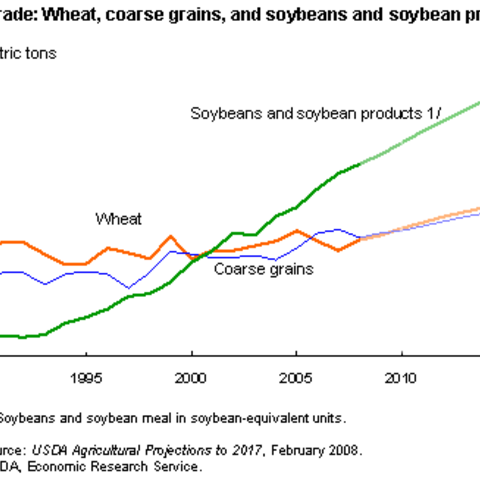
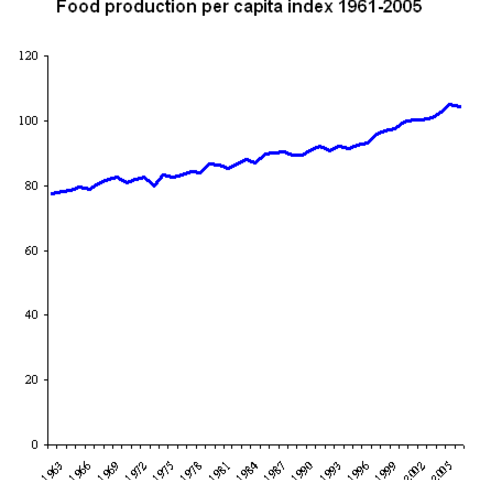
![Chart showing the growth of world food energy consumption from 1961 Chart showing the growth of world food energy consumption from 1961](/sites/default/files/styles/large/public/3-6-chart789_0.png?itok=2Wt0Kgao)
Source: Creative Commons (Jmh649)
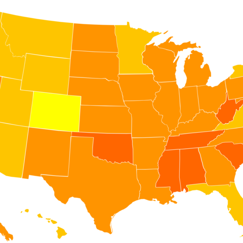
![World Map of obesity in adult males (as % of population with a Body Mass Index over 30) per country, 2008, from under 5% (light yellow) to 35% (dark orange) World Map of obesity in adult males (as % of population with a Body Mass Index over 30) per country, 2008, from under 5% (light yellow) to 35% (dark orange)](/sites/default/files/styles/large/public/3-6-map790_0.png?itok=EHh-qKJ7)
Source: Creative Commons License (Lokal Profil)
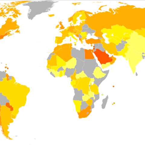
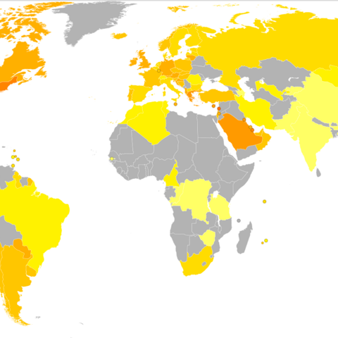
![World Map of obesity in adult females (as % of population with a Body Mass Index over 30) per country, 2008, from under 5% (light yellow) to 40% (red) World Map of obesity in adult females (as % of population with a Body Mass Index over 30) per country, 2008, from under 5% (light yellow) to 40% (red)](/sites/default/files/styles/large/public/3-6-map791_0.png?itok=wcndud2b)
Source: Creative Commons License (Lokal Profil)
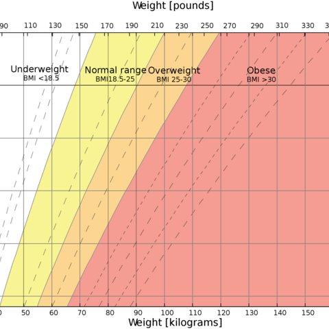
![Body Mass Index Graph showing divisions of underweight, normal weight, and overweight Body Mass Index Graph showing divisions of underweight, normal weight, and overweight](/sites/default/files/styles/large/public/3-6-chart792_0.png?itok=cyhL0atP)
Source: Public Domain
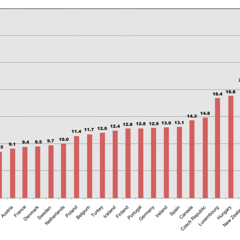
![Chart comparing the OECD countries, showing the populaiton with a Body Mass Index over 30, using data from 1996-2003 Chart comparing the OECD countries, showing the populaiton with a Body Mass Index over 30, using data from 1996-2003](/sites/default/files/styles/large/public/3-6-chart793_0.png?itok=W8dX6_TA)
Source: OECD Factbook
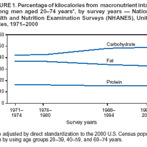
![Chart showing the changes in the types of food consumption in U.S. males Chart showing the changes in the types of food consumption in U.S. males](/sites/default/files/styles/large/public/3-6-chart794_0.jpg?itok=CWp7T_aV)
Source: U.S Department of Health and Human Services
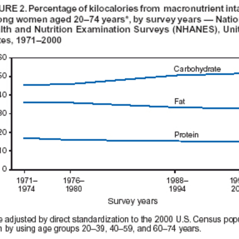
![Chart showing the changes in the types of food consumption in U.S. females Chart showing the changes in the types of food consumption in U.S. females](/sites/default/files/styles/large/public/3-6-chart795_0.jpg?itok=7Rzjcn_M)
Source: U.S. Department of Health and Human Services
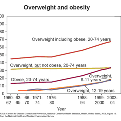
![Graph showing the rate of obesity in adults and overweight in both children and adults in the United States from 1960-2004 Graph showing the rate of obesity in adults and overweight in both children and adults in the United States from 1960-2004](/sites/default/files/styles/large/public/3-6-chart797_0.jpg?itok=7xYYUcXL)
Source: Center of Disease Control
![World Map showing the average daily calorie consumption by country World Map showing the average daily calorie consumption by country](/sites/default/files/styles/large/public/3-6-map798_0.jpg?itok=v5TIu51_)
Source: Creative Commons (Interchange 88)
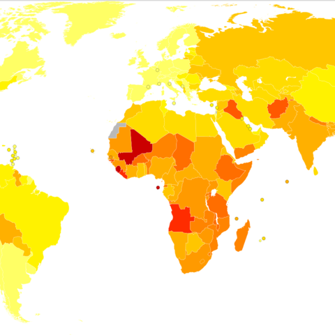
![Age standardized disability-adjusted life year (DALY) per country, a measure of health that incorporates mortality and morbidity. Ranging from Light Yellow (less than 150 years of life lost) to Dark Red (over 1750 years of life lost) per 100,000 inhabitants by World Health Organization Age standardized disability-adjusted life year (DALY) per country, a measure of health that incorporates mortality and morbidity. Ranging from Light Yellow (less than 150 years of life lost) to Dark Red (over 1750 years of life lost) per 100,000 inhabitants by World Health Organization](/sites/default/files/styles/large/public/3-6-map775_0.png?itok=d_SQoaku)
Age standardized disability-adjusted life year (DALY) per country, a measure of health that incorporates mortality and morbidity. Ranging from Light Yellow (less than 150 years of life lost) to Dark Red (over 1750 years of life lost) per 100,000 inhabitants by World Health Organization
Source: GNU License (Lokal Profil)
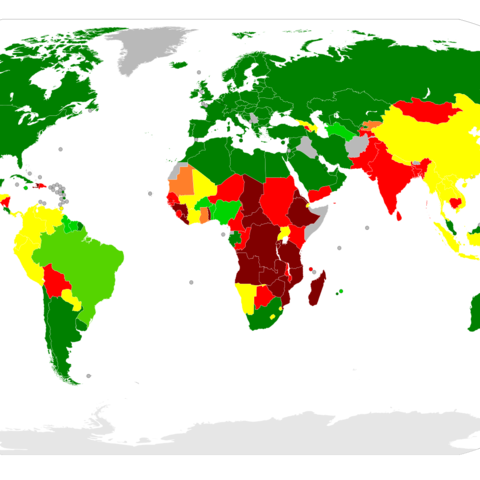
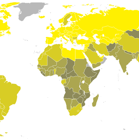
![Countries by percentage of population suffering from undernourishment, 2006 Countries by percentage of population suffering from undernourishment, 2006](/sites/default/files/styles/large/public/3-6-map776_0.png?itok=-9oDs_fT)
Source: GNU License (user Lobizon)
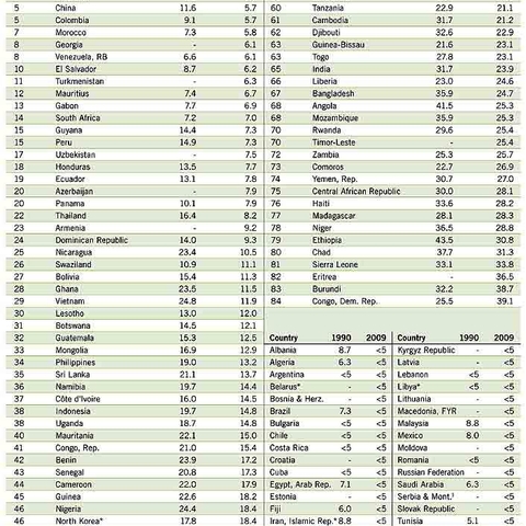
![Chart showing the Global Hunger Index, a measurement of changes in hunger for a number of countries from year to year Chart showing the Global Hunger Index, a measurement of changes in hunger for a number of countries from year to year](/sites/default/files/styles/large/public/3-6-chart777.jpg?itok=9wWX3rNv)
Source: GNU License (Welthungerhilfe)
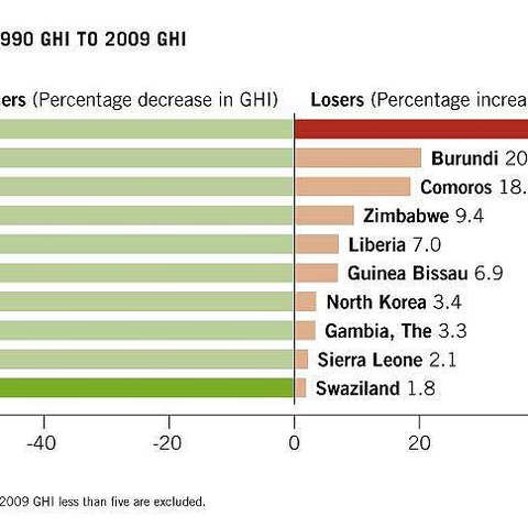
![The Global Hunger Index's winners and losers from 1990 to 2009, showing countries whose hunger situations improved or became worse The Global Hunger Index's winners and losers from 1990 to 2009, showing countries whose hunger situations improved or became worse](/sites/default/files/styles/large/public/3-6-chart778.jpg?itok=LAUVm8G5)
Source: GNU License (Welthungerhilfe)